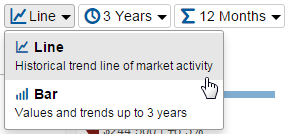
How can I change the chart type?
You can choose to display either a line or a bar chart.
The charted area shows the combination of geographic areas with variables and metrics up to the most complete month of data. You can toggle charted items on and off in the legend. You can select anywhere on a line or bar to see individual values, and you can see the variable elements for each chart just below the x-axis.
Line charts will not show values on the line until selected, whereas bar charts will always show values. When selected, whether a line or bar chart, the date, area, and value will display. Data points are for one month of activity or for 12 months of activity as a single point, depending on whether Monthly or 12 Months is the chosen time calculation, the latter of which is better for trend analysis and accounting for small sample sizes.
Bar charts will show percent changes for the years in which all data used to calculate the percent change is displayed in the chart. So, yes, that empty space is on purpose under the first year of any multiyear selection and for a time calculation set to 1 Year.